Input
Text Fields
<div class="form-field">
    <label for="my-input" class="form-field__label">Email</label>
    <input type="text" id="my-input"/>
</div>
// Form field wrapper
.form-field {}

// Smaller form fields
.form-field--small {}

// Disabled form-fields
.form-field--disabled {}
INPUT MASKING
GUIDELINES
- As the number is being inserted on the input field, it appears formated on the label.
- Once the card type is detected, the other cards slide to the left and disapear underneath each other, leaving the correct card.
VALIDATION
<!--
    When the field has a specific error, we display a message with it
-->
<div class="form-field form-field--error form-field--with-message">
    <label for="myinput" class="form-field__label">Email</label>
    <input id="myinput" type="text"/>
    <div class="form-field__message"><i class="icon-info-alert"></i>Sorry. This is an error message.</div>
</div>

<!-- When we just want to show that the field is in an invalid state, without a specific message -->
<div class="form-field  form-field--error">
    <label for="myinput" class="form-field__label">Password</label>
    <input id="myinput" type="password"/>
</div>
.form-field--error {}
.form-field--warning {}
.form-field--success {}

// This hides the generic error icon
.form-field--with-message {}
GUIDELINES
Valid
-
Happens when users insert valid information. The icon remains until user selects primary action.
No copy message required, the positive feedback is implicit.
Alt text for checkmark icon should inform user that the information is valid.
Warning
-
Message appears when user doesn't fill in required information.
May also appear in cases of invalid information - incorrect phone number structure for example.
This type of message, pushes the content of the page down.
- Tooltip icon: 14px icon, with -2px of baseline shift.
-
Background #fcb314
Icon + text color #444
Clearview 12px
15px Line height
Specific Error
-
"Specific" error messages refer to up to 3 errors that occur in specific input fields. For 4 or more errors, there should be applied a generic error.
Appears after users click the primary action button on the form. This is a backend validation message.
Pushes the content down the page.
-
Background #E00000
Icon + text color #FFF
Clearview 12px
15px Line height
Generic Error
- When filling a form if more than 3 fields have an error than it’s considered generic. Those error messages are displayed in a single column next to the fields in order to avoid obstruct the legibility of the form. See example.
TEXT FIELD SIZES
XXL
320 px
37 characters
XL
270 px
30 characters
L
200 px
20 characters
M
150 px
16 characters
S
120 px
12 characters
XS
60 px
5 characters
XXS
40 px
2 characters
.form-field--xxl {}
.form-field--xl {}
.form-field--l {}
.form-field--m {}
.form-field--s {}
.form-field--xs {}
.form-field--xxs {}
.form-field--autosize {
    max-width: none;
    width: auto;
}
Compound Text Fields
Login Field
Drop-downs
to be codedCharacters and line break
Possible scenario example
GUIDELINES
- Width: Variable up until a max of 320px
- Height: Variable up until a max of 227px
Text Format
-
Clearview Book 14pt
Maximum of 37 characters before truncation
Box grows according to content up to a maximum of 320px. -
Clearview Book 12pt
Maximum of 120 characters
Box grows according to content
DROP DOWN SIZES
XXL
320 px
37 characters
XL
270 px
30 characters
L
200 px
20 characters
M
160 px
16 characters
S
130 px
12 characters
XS
80 px
5 characters
XXS
55 px
2 characters
GUIDELINES
- In all field sizes, the label can have a maximum of 60 characters plus a lorem ipsum.
Text Format
-
Clearview Book 12pt
Maximum of 200 characters
Text box maximum of 270px width.
Natural Language Form
H1
I would like to
about
.
GUIDELINES
- Font size: 48px
Line-height: 55px
Letter-spacing: -1px
Word-spacing: 2px
Max. characters: 30
Max. 3 lines of text - Drop-down menu: if max. characters is reached, downscale to H2.
- Drop-down arrow: 20px
Distance between option and arrow: 2px - When re-opening the dropdown, the selected item should be aligned with the text from the natural
language form.
- Drop-down height: 80% of the window height
- Drop-down width: variable. Max. 450px
h2
I would like to about .
GUIDELINES
- Font size: 36px
Line-height: 45px
Word-spacing: 2px
Max. characters: 40
Max. 3 lines of text - Drop-down menu: if max. characters is reached, downscale to H3.
- Drop-down arrow: 20px
Distance between option and arrow: 2px - When re-opening the dropdown, the selected item should be aligned with the text from the natural
language form.
- Drop-down height: 80% of the window height
- Drop-down width: variable. Max. 400px
h3
I would like to about .
GUIDELINES
- Font size: 24px
Line-height: 30px
Word-spacing: 2px
Max. characters: 68
Max. 3 lines of text - Drop-down menu: if max. characters is reached, downscale to H4.
- Drop-down arrow: 14px
Distance between option and arrow: 2px - When re-opening the dropdown, the selected item should be aligned with the text from the natural
language form.
- Drop-down height: 80% of the window height
- Drop-down width: variable. Max. 320px
h4
I would like to about .
GUIDELINES
- Font size: 18px
Line-height: 25px
Max. characters: 161
Max. 3 lines of text - Drop-down menu: if max. characters is reached, downscale to H5.
- Drop-down arrow: 10px
Distance between option and arrow: 2px - When re-opening the dropdown, the selected item should be aligned with the text from the natural
language form.
- Drop-down height: 80% of the window height
- Drop-down width: variable. Max. 320px
h5
I would like to
about
.
GUIDELINES
- Font size: 14px
Line-height: 20px
Max. characters: 240
Max. 3 lines of text - Drop-down menu: Minimum size available.
If text reaches max. characters then truncate text.
- Drop-down arrow: 7px
Distance between option and arrow: 2px - When re-opening the dropdown, the selected item should be aligned with the text from the natural
language form.
- Drop-down height: 80% of the window height
- Drop-down width: variable. Max. 310px
Tag Cloud
Max. width of tag cloud depends on the available area.
Table
Variable height
GUIDELINES
- Always center align elements to each row.
- Row’s height is variable according to content. This happens in cases of multi-line rows.
- Columns should have a minimum padding of 20px between each other.
- Content is left justified, vertically, in each column.
- For short table, up to 10 rows:
- there will be no scrolling behavior;
- do not use zebra striping;
- use horizontal divider.
- For more than 10 rows:
- the table should be using scrolling behavior and sticky table header (when applicable);
- shading in alternate single row;
- if table is presented with more than 40 rows it is suggested that blocks of three lines be alternately shaded.
Exception:
Tags on tables and lists have a white background.
- Logged user always appear as first item on a table or list.
- Hover on entire line shows options.
- Links is tables are exposed on hover over line. Links displays its default state.
- If options drop-down is active line is blocked with light blue, #C3DFED.
- Hover on link when icon drop-down is active.
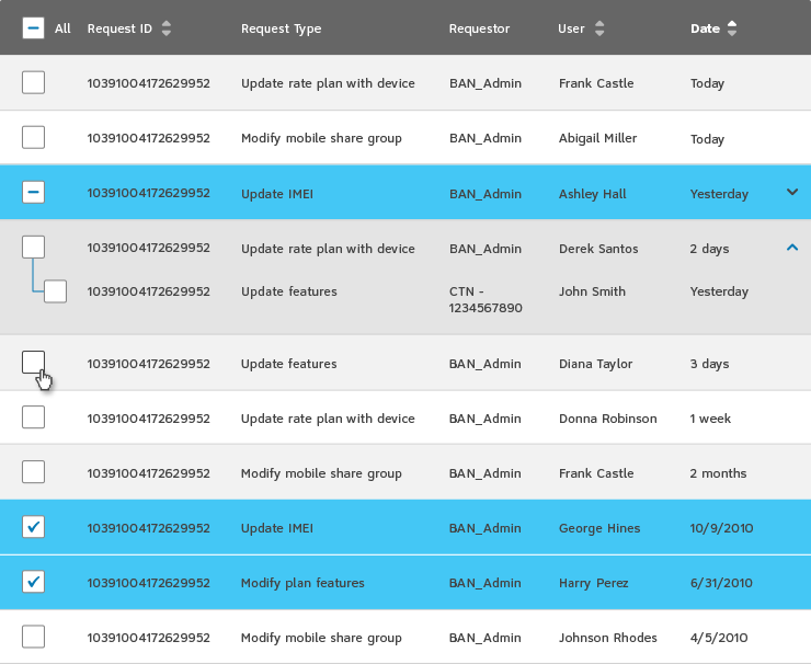
Table with Bulks Actions

GUIDELINES
- Use expander in tables when there’s more options inside a row.
- The content inside must match the header of the table it’s included.
- When expander is opened make sure content in table is aligned.
- Selected lines:
Background #C3DFED
Carousels
STANDARD
GUIDELINES
- Simplified pagination mostly used in plan cards display and image thumbnails.
- Appropriate when there’s less that 7 items.
- The arrows help navigate between items, one by one. If there’s space constraints the minimum padding between arrows and carousels is 10px.
- Carousel background and border: #F2F2F2, 90% opacity.
Dividers
System
Feedback
Modals
Your session is about to timeout.
For security reasons your session will expire in 5 minutes..
Unable to process payment.
For some reason the system crashed type of message. Please try again later or contact our online support.
<!--
    Add "data-modal" to an element to make it a modal container.
    An ID is useful to set as the target for the modals "show" trigger.

    Add 'data-read-only="true"' to prevent the modal from being closed
    when clicking the overlay.

    Available modifiers:

    * att-modal--warning - Displays a warning icon and sets the title color to orange
-->
<div data-modal data-read-only="true" id="information-modal-demo">
    <h2 class="att-modal__title">Your session is about to timeout.</h2>

    <div class="att-modal__body">
        <p>For security reasons your session will expire in <strong>5 minutes.</strong>.</p>
    </div>

    <div class="att-modal__footer">
        <a data-close class="button button--secondary button--small">Log out</a>
        <a data-close href="#" class="button button--small button--primary">Keep logged in</a>
    </div>
</div>

<!--
    To create a modal trigger add the following to an anchor/button:

    * data-role="show-modal"
    * data-target="#id-of-the-modal-container"

    Any element with "data-close" inside the modal container
    will automatically close the modal when clicked
-->
<a data-role="show-modal" data-target="#information-modal-demo" class="button button--small button--primary">Click to show Modal</a>
/**
 * Instantiating a modal programmatically:
 */

$(function() {
    var $myModal = $('#modal-selector');

    $myModal.modal({
        /**
         * If the modal should be closed when clicking the overlay
         *
         * @type {Boolean}
         * @default false
         */
        readOnly: false
    });

    $('button.show-modal').on('click', function() {
        $myModal.modal('show');
    });

    $('button.show-modal').on('click', function() {
        $myModal.modal('hide');
    });
});
GUIDELINES
- Appears over white background (#FFF) with 80% transparency .
-
For pages with data entry, use a type of OK and CANCEL buttons: describe what
the buttons do in the body copy (OK saves the user’s changes and closed the
window, CANCEL discards any changes and closes the window).
Primary action should be the safest action of the one that is recommended by the system. - Reserve modal dialogs for times when it’s absolutely necessary to gather information or alert a user to something urgent
- A modal blocks input to some other top-level windows in an application. This type of dialog boxes requires a type of input/response from the user.
-
There are 2 situational categories where modals are commonly used
- Warnings: to warn users of a potentially harmful situation;
- Confirm, Help or Prompt: to remind users to do something before moving forward and to inform users of important information.
- Use modals only when there is no other alternative (they are disruptive, cause mode errors, steal focus and gloss over UI designs;
- Use inline editing and other means to avoid breaking the users’ stride (unless necessary);
- Place modals in close proximity to the link or button or action that triggers it;
- Allow users to close the window with the “ESC” key;
- Use CANCEL buttons when it’s correct to do so;
- Close the window when users click outside it (except when there’s a CANCEL button);
- Modals should never contain scroll bars, tables and large amounts of text.
- If the modal is for read only, use a CLOSE icon.
Text Format
-
Omnes Light 36pt
Maximum of 28 characters in a 220px width box.
Break paragraph when appropriate.
-
Clearview Book 14pt
Maximum of 166 characters, 4 lines of text, in a 300px width box.
Break paragraph when appropriate.
Loading
USED IN MULTIPLE SIZES
MINIMUM SIZE
LOADING WITH COUNT
Tooltips
GUIDELINES
- Use when an interaction with your website is not necessarily intuitive and self-explanatory.
- When the meaning or definition of an action is not necessarily intuitive and self-explanatory.
- Use to gently introduce functionality to the new and untrained user.
- Use when you want to guide the user to get a good start with a web application.
- Use white tooltips for all elements in the website that are on a #F2F2F2 or colored background.
- Use dark tooltips only to describe the name of an action, such as icons.
- Use dark tooltips on tables, lists and tree-view UI.
- Use grey tooltips for all elements in the website that are on a #FFF background.
Pop Overs
GUIDELINES
- Popover opens on click. Closes with click on icon or on any other area outside of popover, or by pressing ESC key.
- 20px fixed padding on all sides (includes 1px border).
- Text can wrap.
- Height and width are variable.
Max. width 490px.
Controls
Video Controls
DEFAULT ON LANDING PAGE
GVP CONTROLLER VIEW - PLAY/PAUSE
GVP CONTROLLER VIEW - PROGRESS BAR
GVP CONTROLLER VIEW - VOLUME
GVP CONTROLLER VIEW - CC
GVP CONTROLLER VIEW - FULL SCREEN
Pagination
Small Page Count
GUIDELINES
- Page range: up to 10 pages
- When moving from page 1 to the next pages, indicate the current page.
- Because all items are exposed there’s no need to add “Previous” or “Next” arrows.
- Pagination with keyboard access. Arrows righ and left to navigate between pages.
Medium Page Count
GUIDELINES
- If pagination has more than 10 pages.
- Page range: up to 100 pages.
- On page 6 truncate the list, showing the first two pages, 3 middle pages, and the last two pages.
- Use ellipsis to simbolize truncated pages.
- For medium page, to show N items per page, it is usually better to offer a single default number, such as 10 or 20 and supplement it with “view all” option.
- Offer content sorting and filtering to the user when offering choice to display option for medium page count.
- Because the first and last page numbers are exposed, there's no need to include the "Last Page" and "First Page" links.
Large Page Count
GUIDELINES
- If pagination has more than 100 pages.
- Page range: up to 1000 pages
- Display: 5 Total choices
- For large page count, the option to “View All” would generate a large page choices so, give users the choice between two numbers; for instances 20 and 60, where the second number is substantially bigger than the default.
- Offer content sorting and filtering to the user, this is especially essential for large numbers of items. User might want to sort of filter the search result to limit the alternative of choices.
Views per Page
GUIDELINES
- “Views per page” always appears on the top of the content and includes a “view all” option.
- The larger the user’s window is, the more results you should show.
- Use a single default number, such as 20, and supplement it with “View All” for users who want more.
- The larger the user’s window is, the more results you should show.
- Alternatively, if “ View All” would generate an unwieldy page, give users the choice between two numbers, 20 and 60, where the second number is substantially bigger than the default.
- The smaller the result, the more should be show per page.
- Linear content flows should never be broken up into multiple screens.
- If fetching results takes too much time, bringing more result per page will save the user’s time and will increase positive user experience.
- Use a maximum of 3 and minimum of 2 choices for “views per page”, and that are substantially distant from each other.


